
01 Project Overview
Stillflow is a wellness and meditation brand inspired by the calm rhythm of Canadian nature.
The market was crowded with look‑alike wellness brands using generic pastel tones and cliché symbols, so the goal was to create a minimal, timeless identity that stands out through visual serenity and subtle emotional depth.
The market was crowded with look‑alike wellness brands using generic pastel tones and cliché symbols, so the goal was to create a minimal, timeless identity that stands out through visual serenity and subtle emotional depth.
02 Brand Strategy
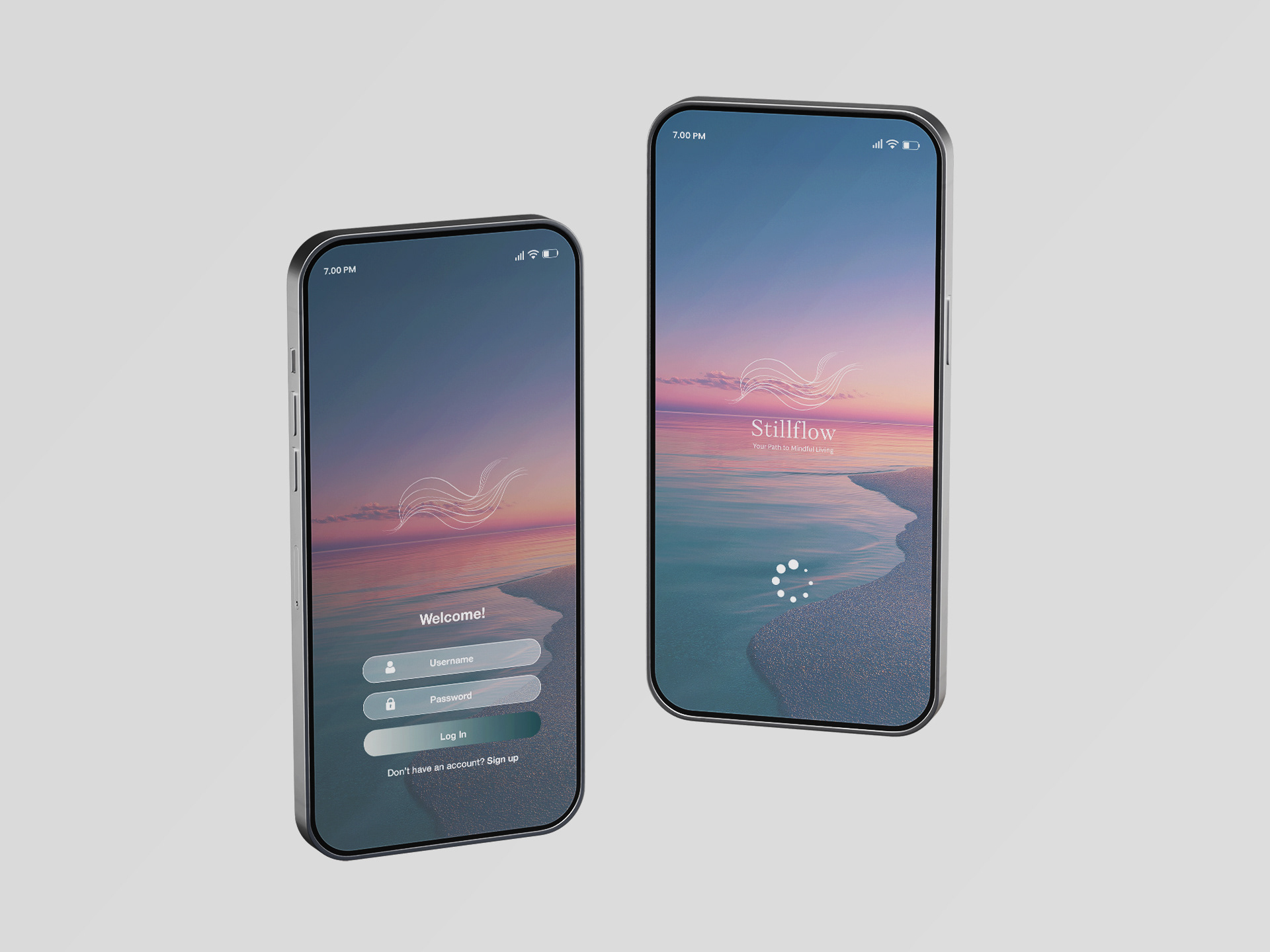
Stillflow positions itself as a modern wellness companion that guides people toward balance and clarity in their everyday lives. Rather than relying on conventional “soft wellness” imagery, the brand embraces a modern calm—merging natural flow with digital clarity.
The tagline, “Your Path to Mindful Living,” expresses Stillflow’s purpose: becoming a trusted guide for those seeking peace in a fast‑moving world. The identity combines fluid motion with serene colour gradients to reflect the balance between technology and tranquillity.
The tagline, “Your Path to Mindful Living,” expresses Stillflow’s purpose: becoming a trusted guide for those seeking peace in a fast‑moving world. The identity combines fluid motion with serene colour gradients to reflect the balance between technology and tranquillity.
03 Logo, Color Palette & Icon
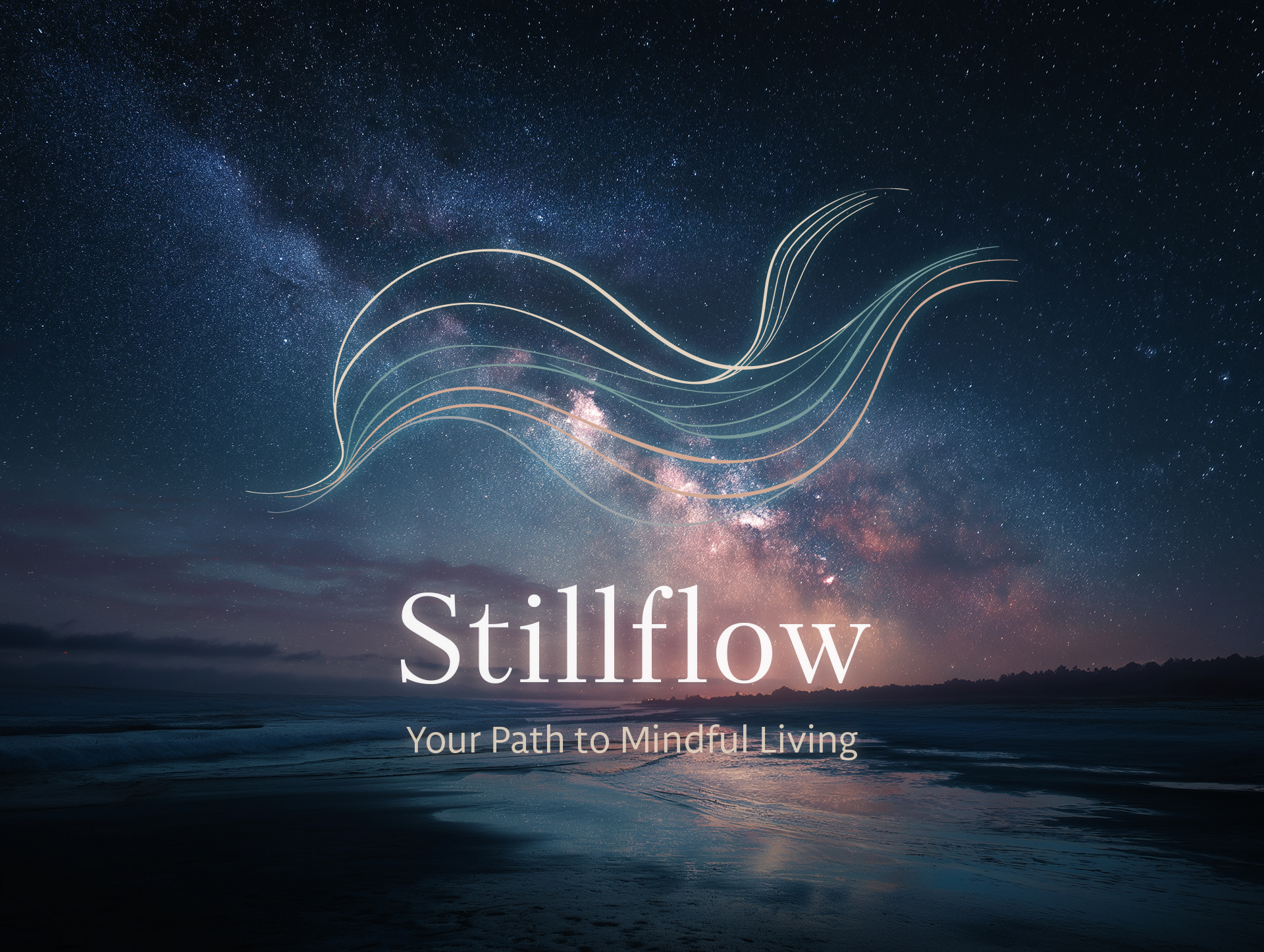
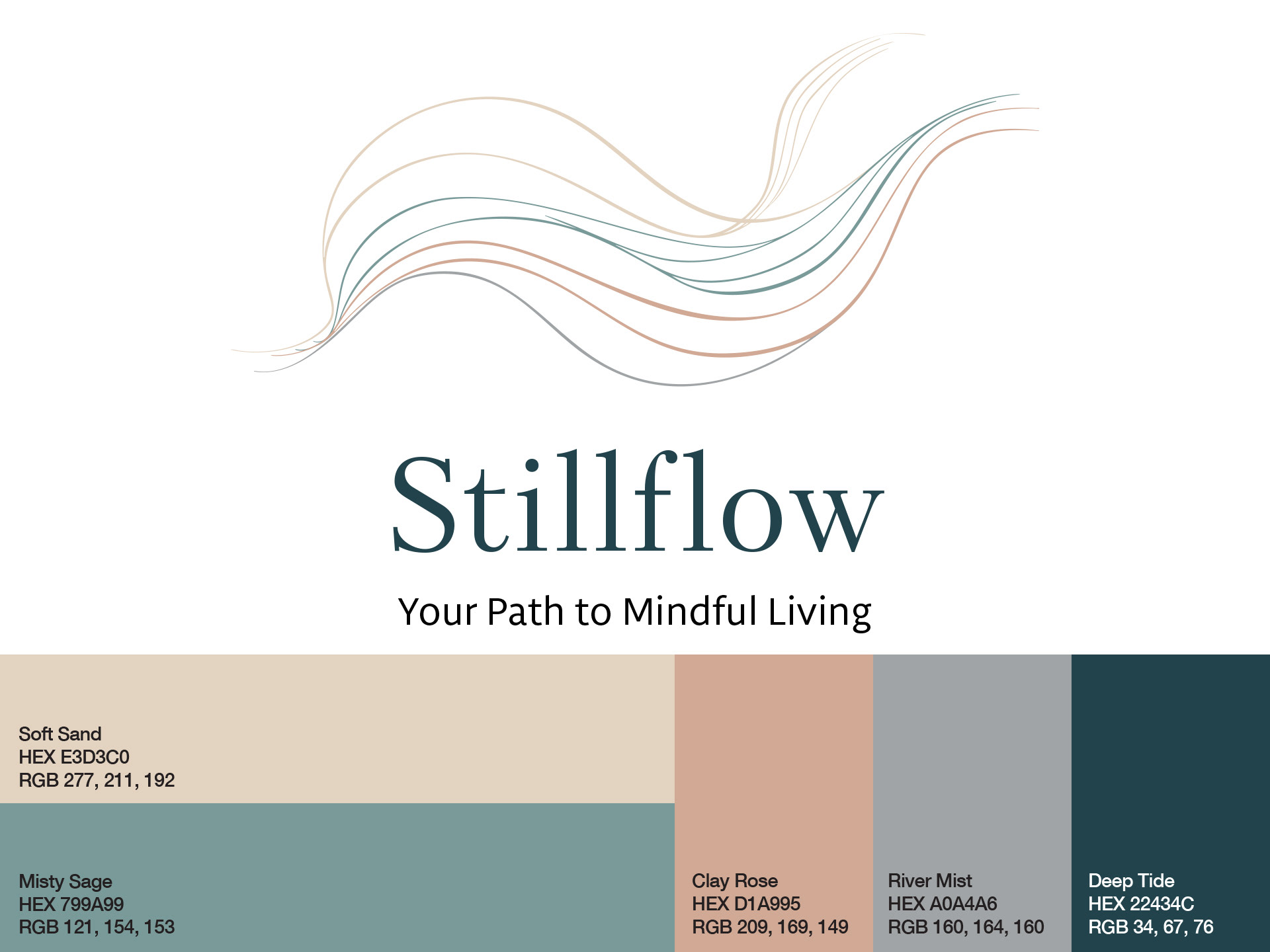
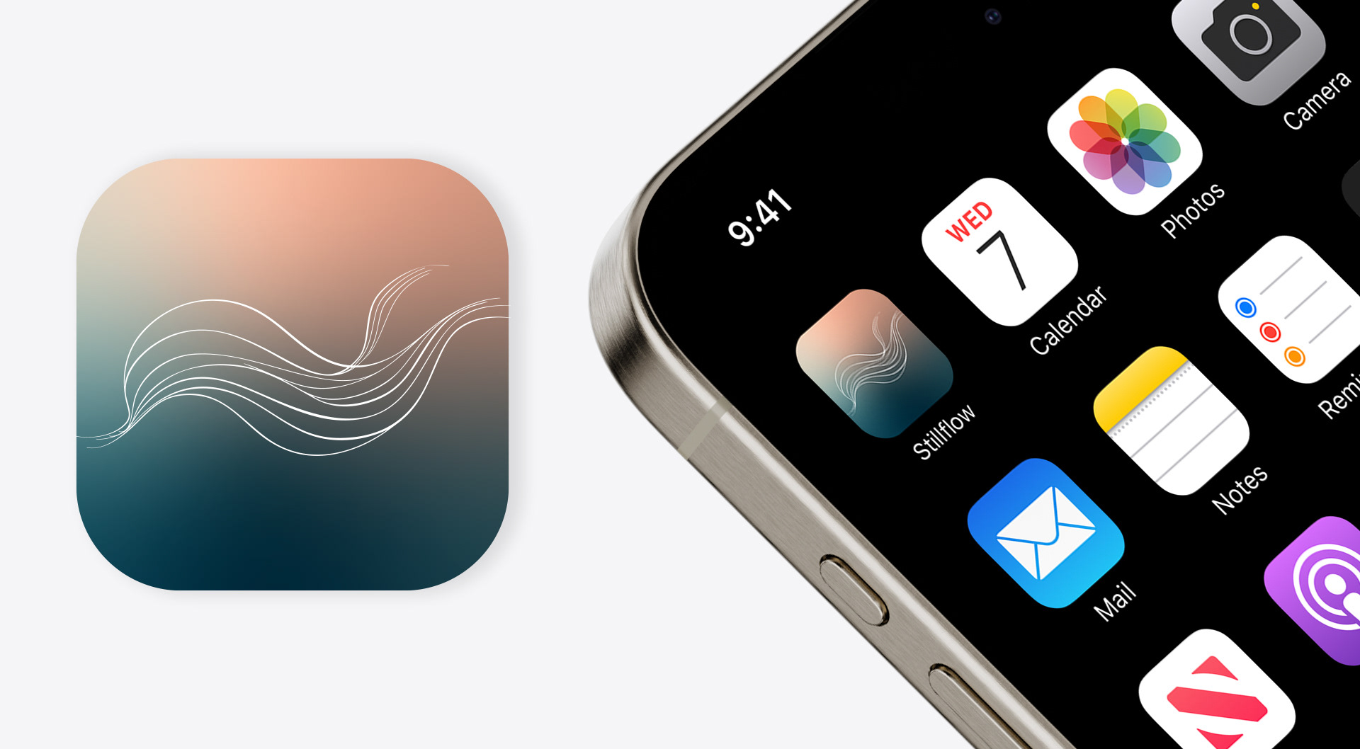
The Stillflow logo unites fluid lines inspired by nature with a refined serif wordmark. The curves suggest water and wind in motion, while the lettering conveys quiet strength—together expressing a feeling of harmony, presence, and mindful living.
04 Key Visuals
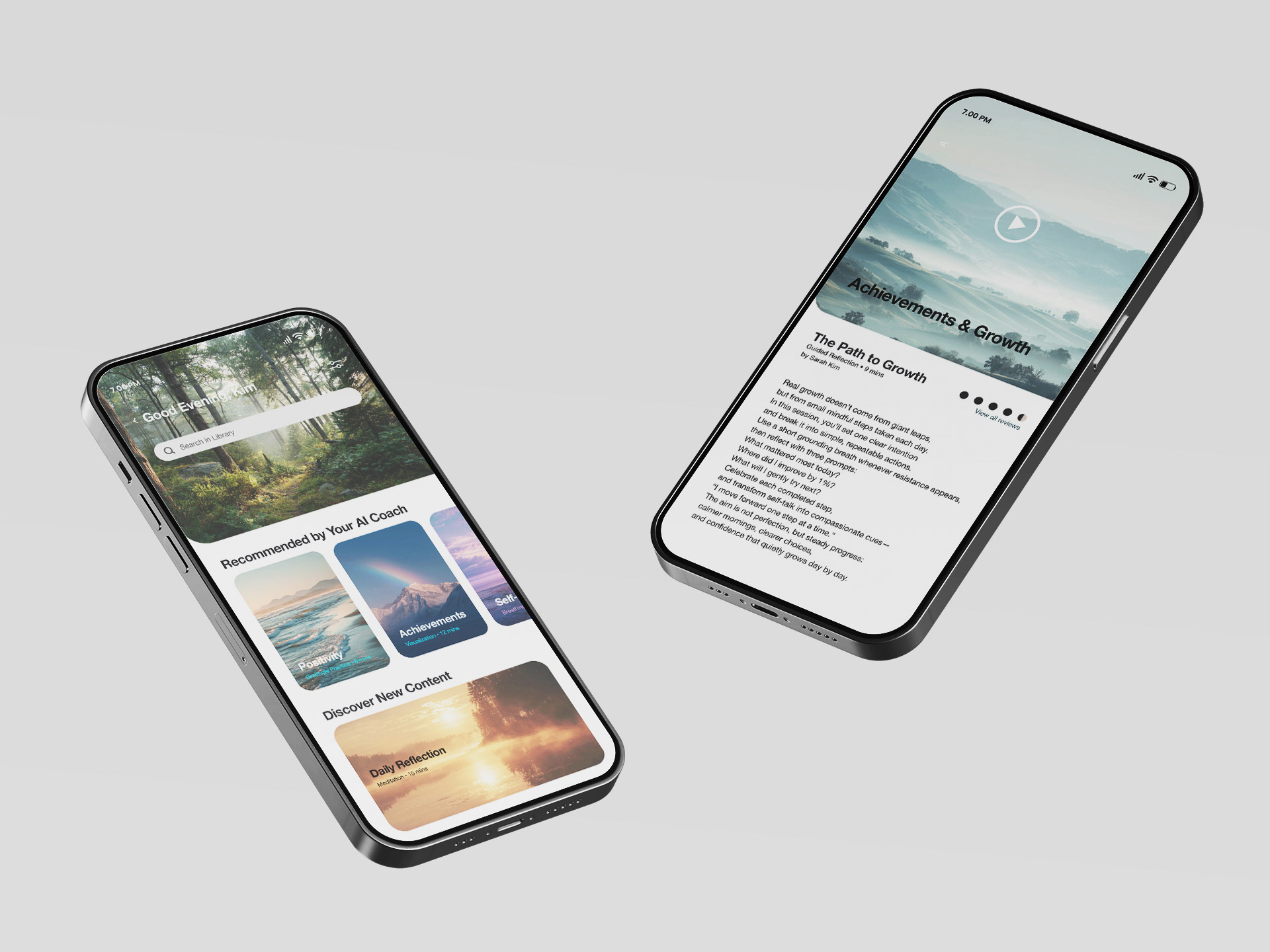
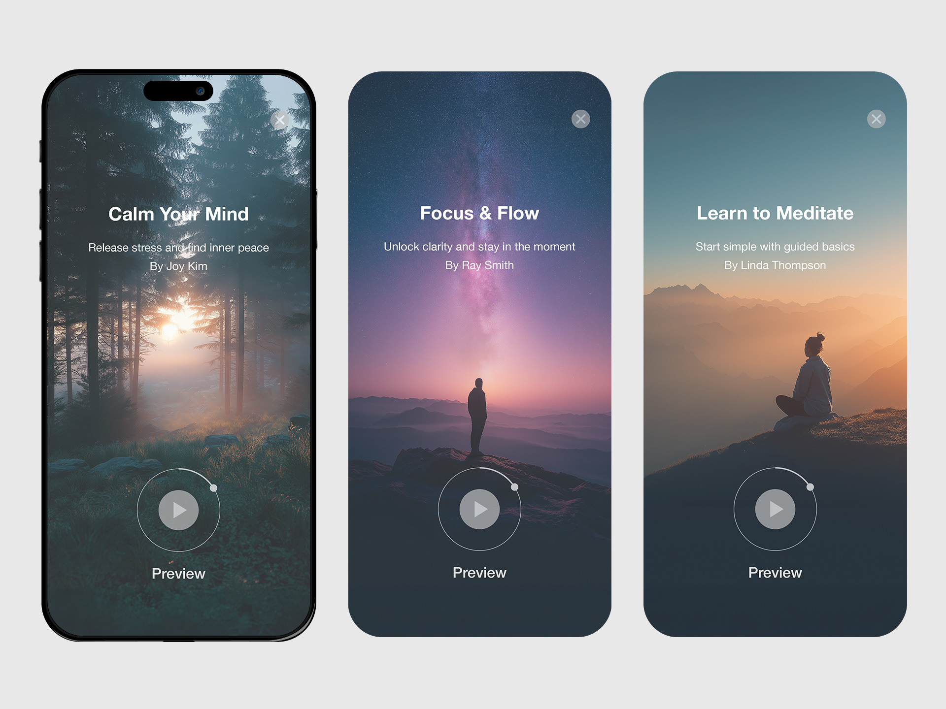
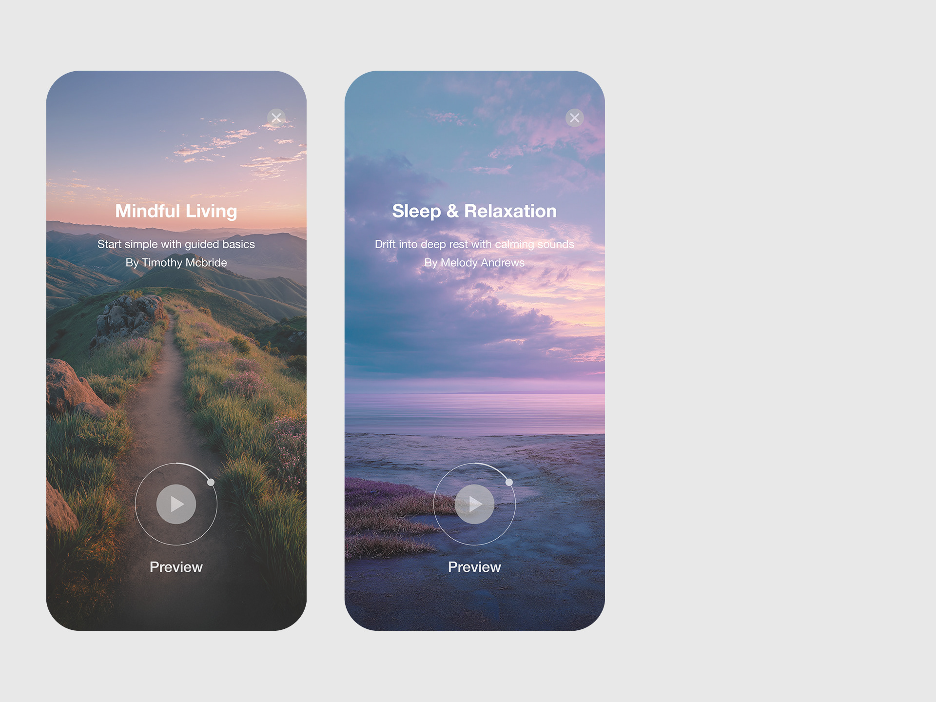
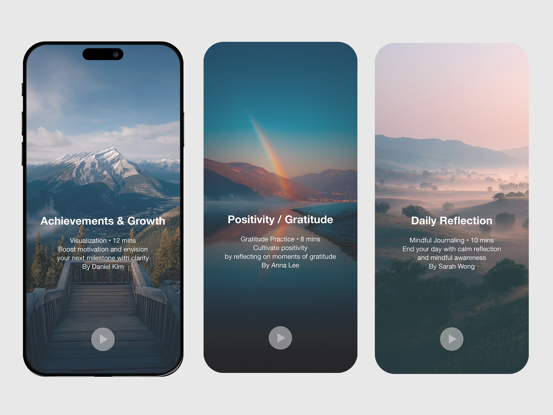
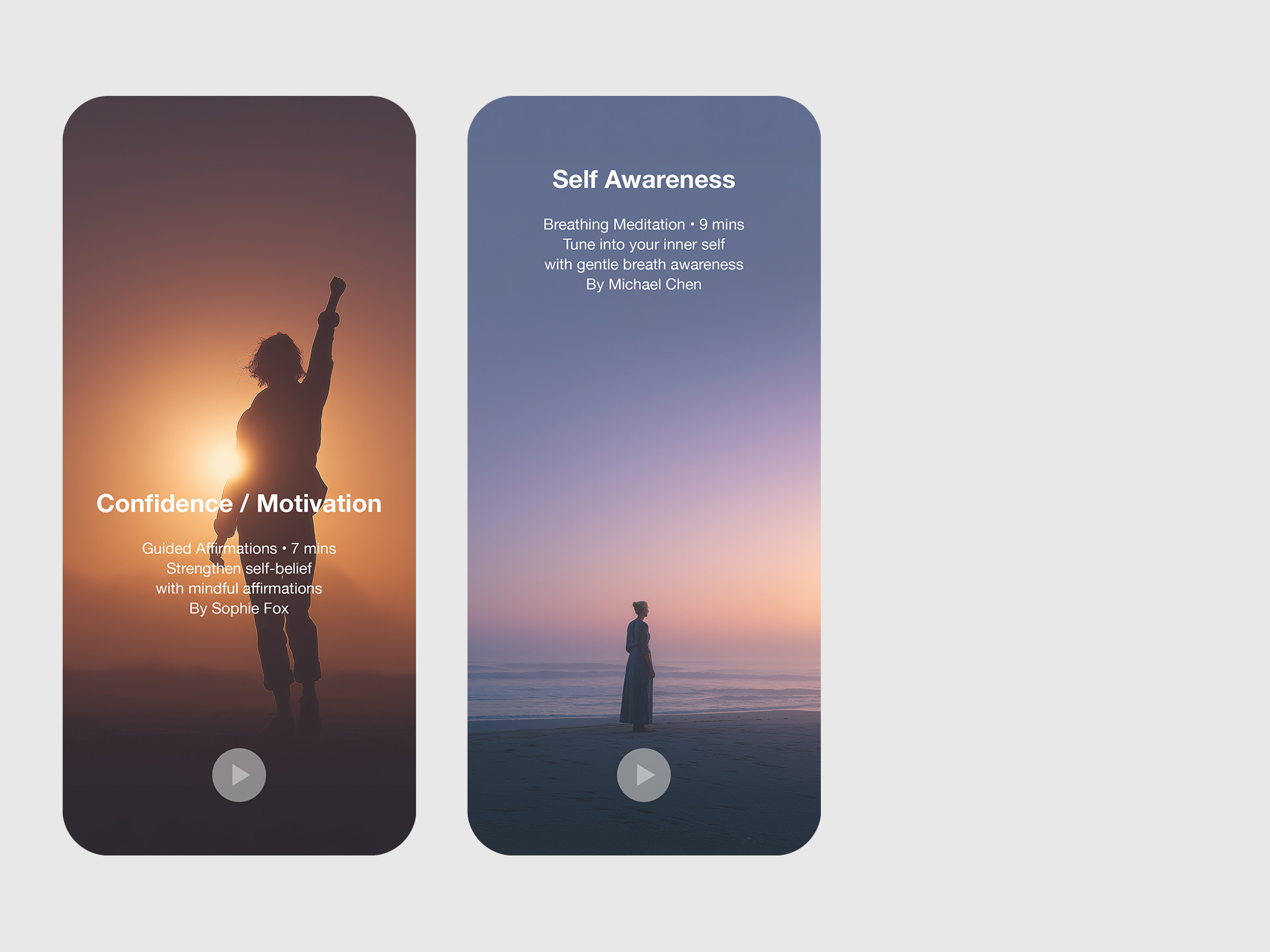
Key visuals draw from forests, lakes, and calm skies to create a grounded sense of serenity. Soft, cinematic compositions establish a mood of stillness, while hero images and session cards are used across app screens and promotional materials to build a cohesive, calming brand experience.
© 2025 Ieum Creative
Connecting ideas, people & brands.
Let’s create something meaningful together.
✉️ hello@ieumcreative.com
Connecting ideas, people & brands.
Let’s create something meaningful together.
✉️ hello@ieumcreative.com