
Overview
Smith Harbor is a boutique brand for personalized children’s clothing and home goods, selling primarily through Etsy and online retail. The goal was to move the brand away from a casual hobby‑shop look toward a premium “heritage botanical” identity that parents would trust for gifts, keepsakes, and family traditions.
Challenge
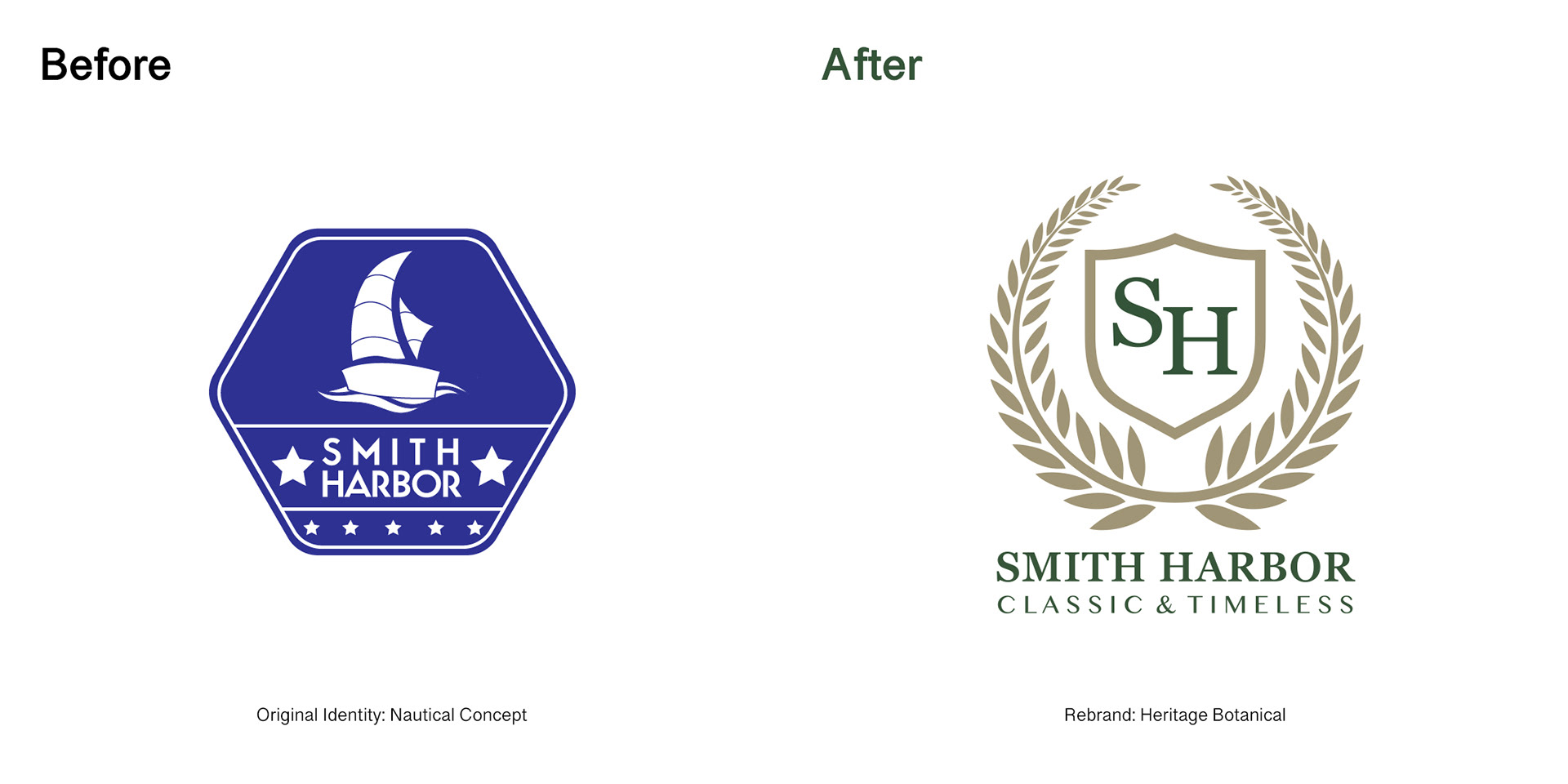
The original logo leaned heavily on generic nautical clichés and felt more like a souvenir shop than a refined, heirloom‑quality brand. Visually, it lacked consistency across embroidery, labels, and digital touchpoints, making it difficult to build recognition or justify premium pricing.
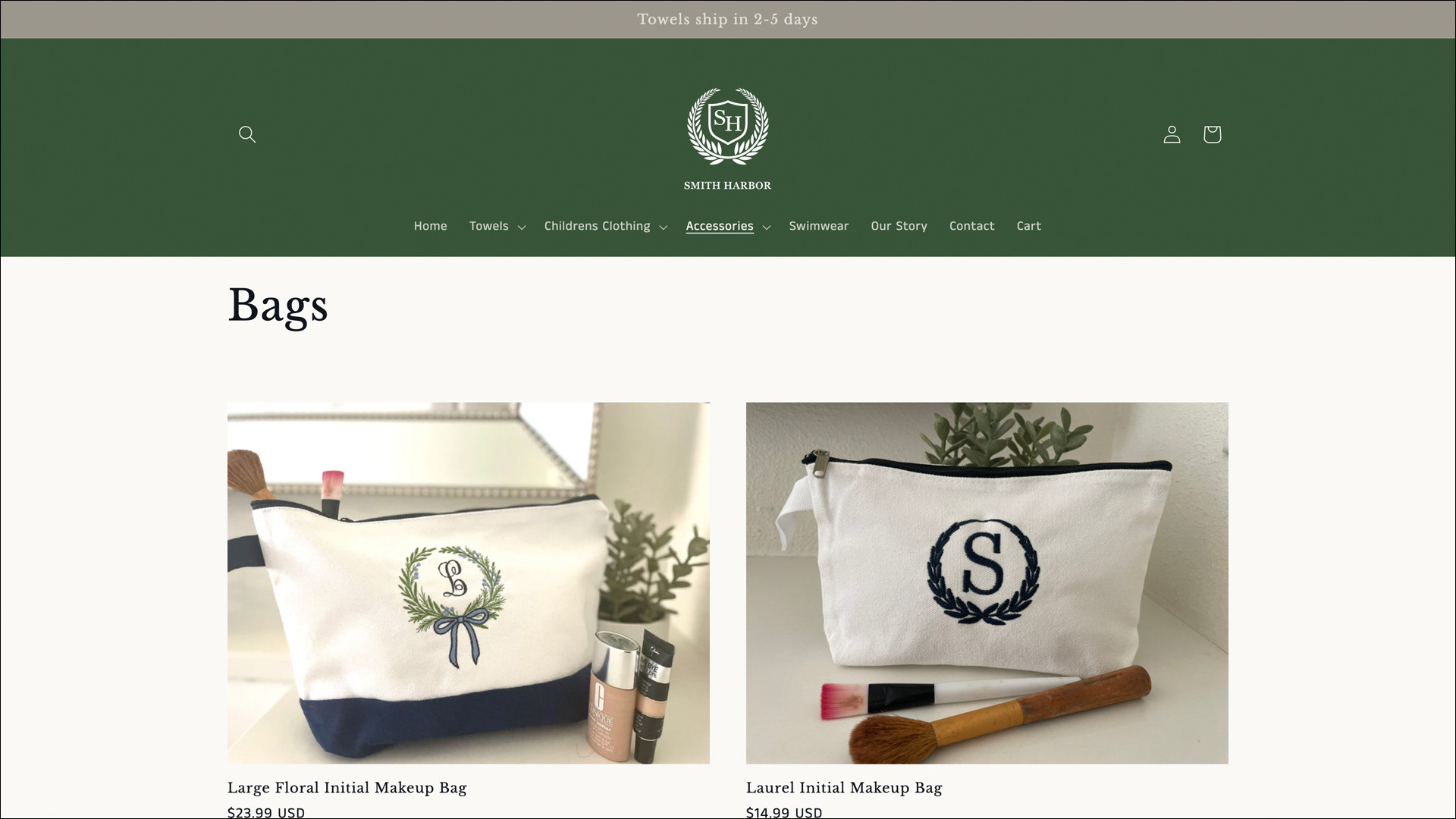
New crest applied to embroidered bags and accessories, designed to stay crisp even at small sizes.
Updated storefront visuals and featured products using the new crest and colour system.
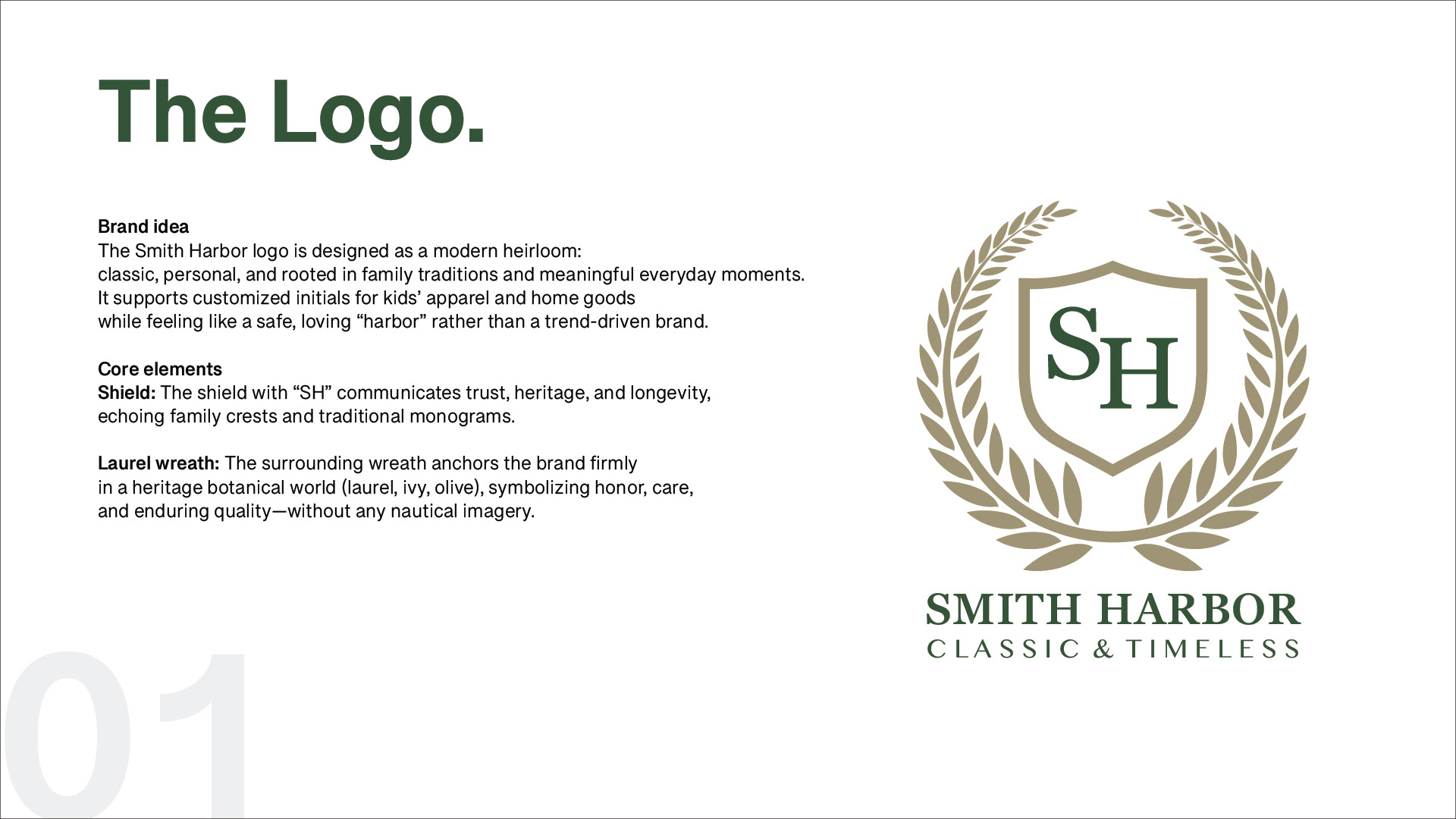
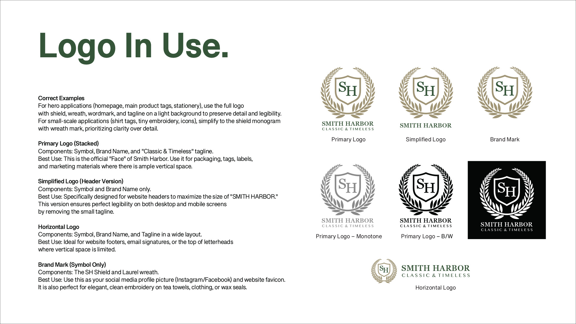
Logo Concept
The new mark centres on a hand‑drawn ivy wreath framing a shield monogram, suggesting growth, protection, and a sense of timeless family heritage. The crest structure balances classic proportions with simplified forms so the logo remains legible from tiny embroidery sizes to large signage and packaging.
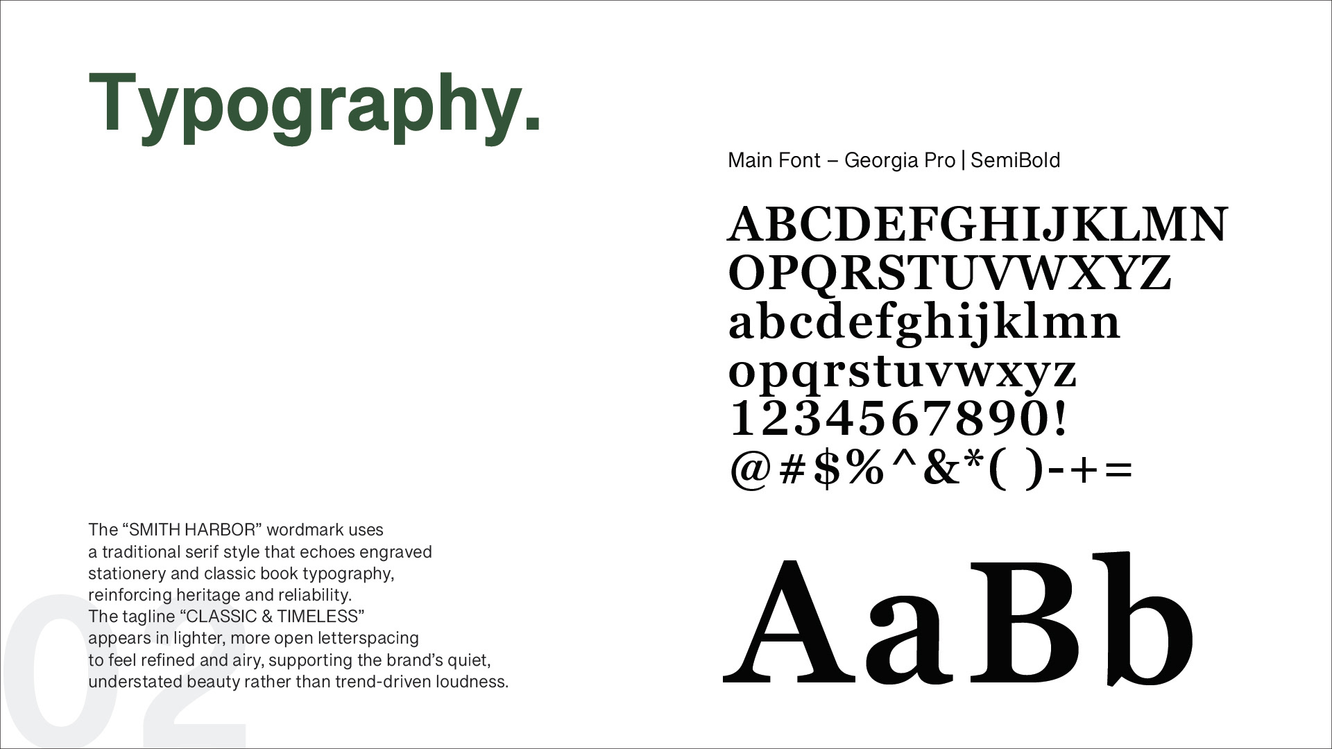
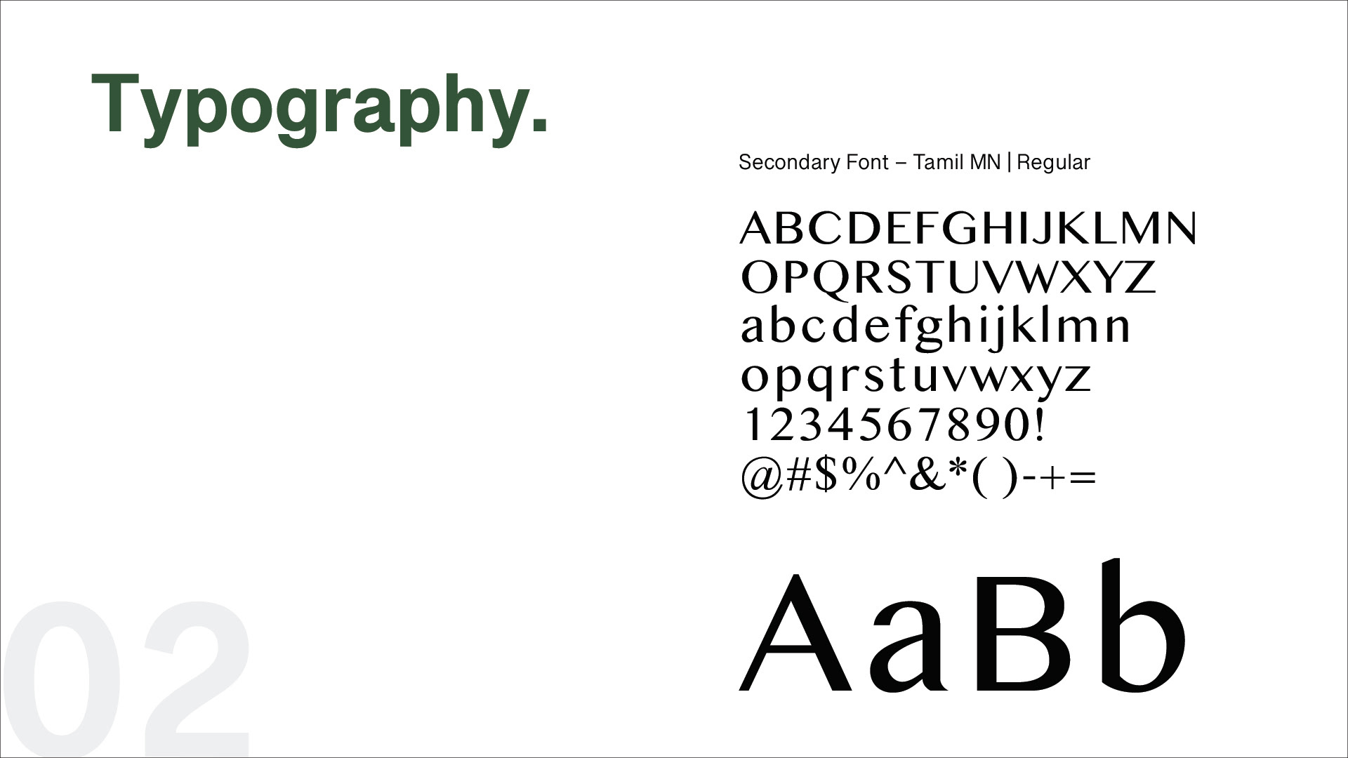
Typography
A refined serif wordmark and supporting type system were chosen to echo traditional stationery and school emblems, reinforcing trust and longevity. Hierarchy is kept clear and minimal, allowing names, dates, and personalization details to sit elegantly beside the crest without competing for attention.
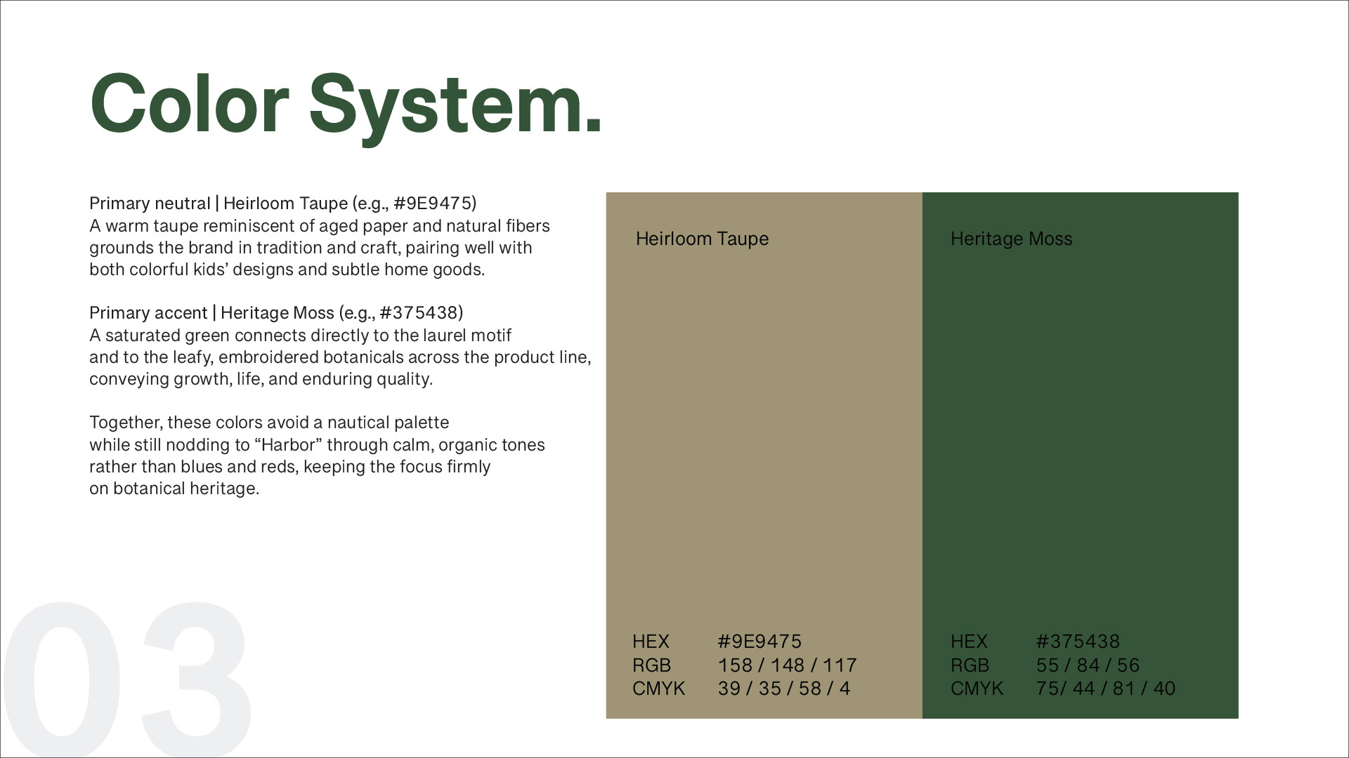
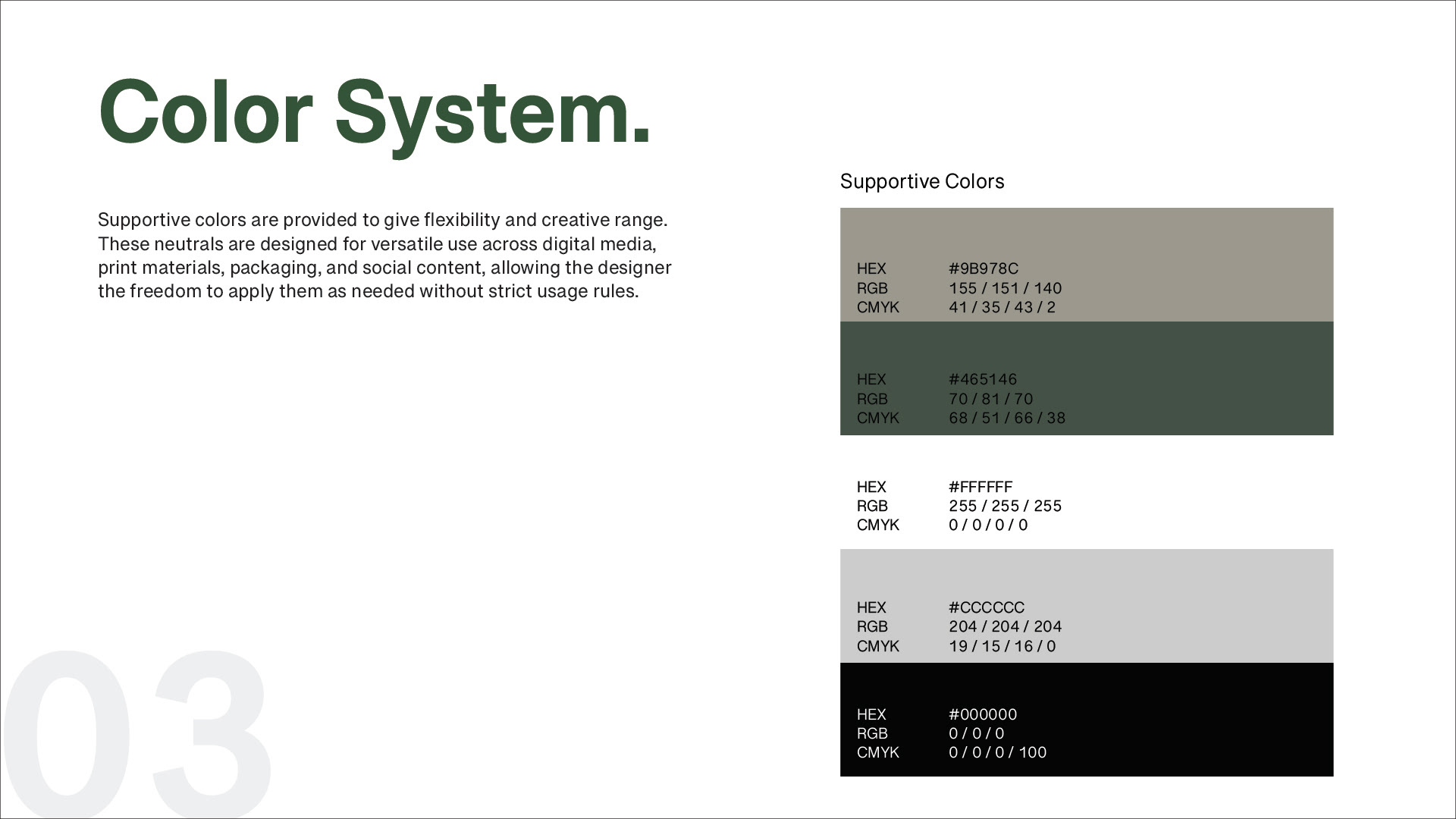
Color System
The palette pairs muted evergreen with warm neutrals, inspired by coastal foliage, worn canvas, and vintage book covers.
These tones create a calm, grounded atmosphere that feels both nautical and botanical—premium enough for gifting, yet gentle enough for children’s products.
These tones create a calm, grounded atmosphere that feels both nautical and botanical—premium enough for gifting, yet gentle enough for children’s products.
© 2025 Ieum Creative
Connecting ideas, people & brands.
Let’s create something meaningful together.
✉️ hello@ieumcreative.com
Connecting ideas, people & brands.
Let’s create something meaningful together.
✉️ hello@ieumcreative.com