
Overview & Strategy
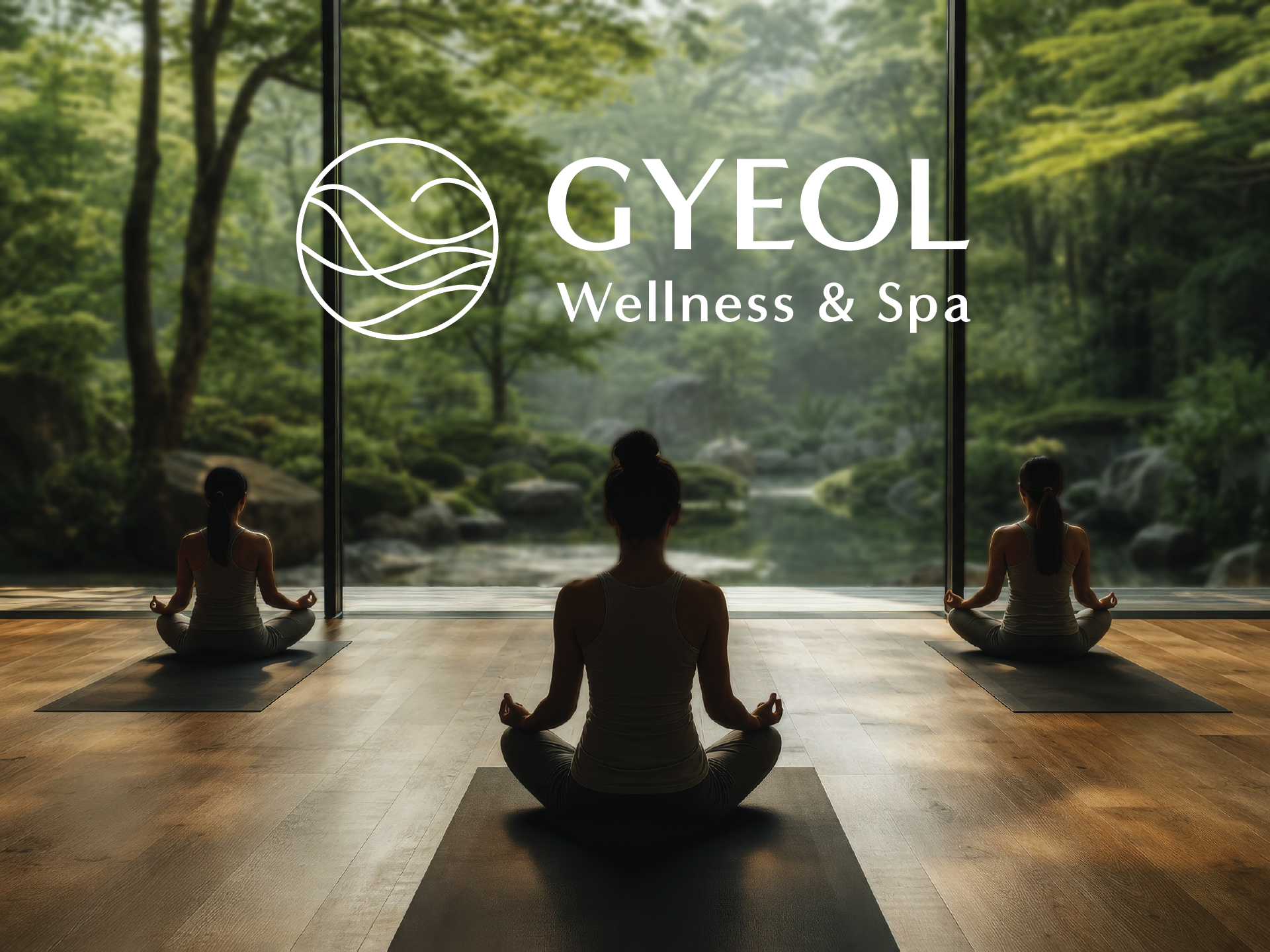
Gyeol Wellness & Spa is a fictional Korean-rooted wellness brand developed as a portfolio case study. The project explores how a brand identity can be built entirely from cultural meaning rather than trend.
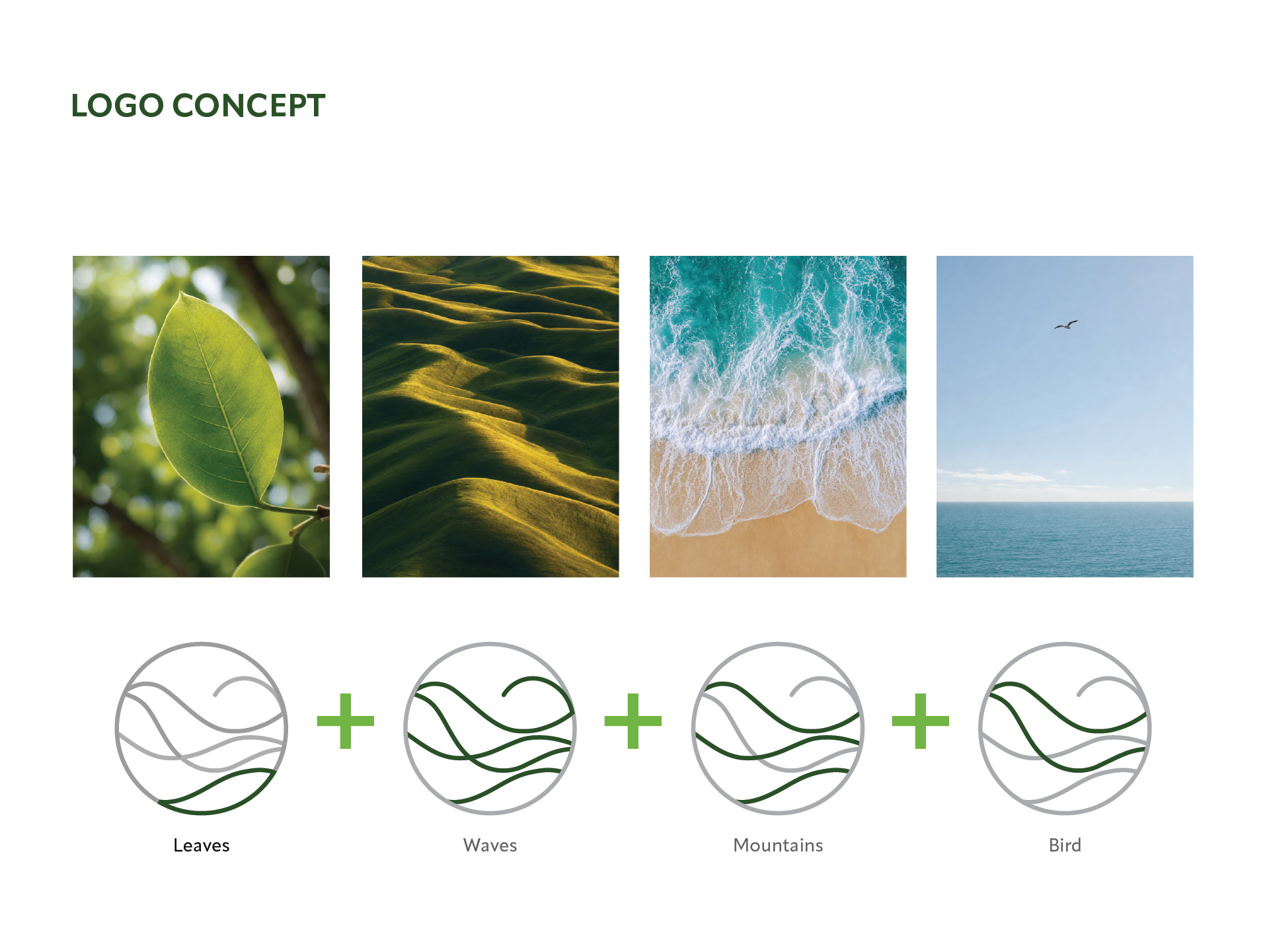
The name Gyeol (결) — meaning the grain or texture found in all living things — became the strategic foundation. Every visual and verbal decision traces back to this single concept.
Target audience: working women in their 20s–40s in North America seeking intentional, nature-rooted wellness experiences.
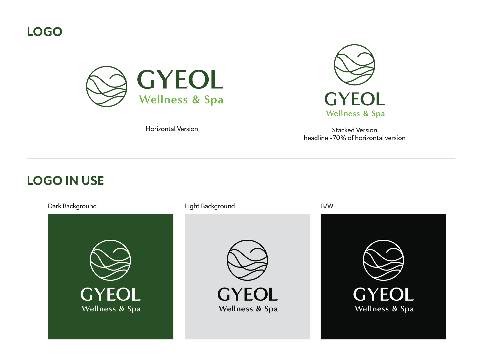
Concept & Logo, Color Palette & Typography
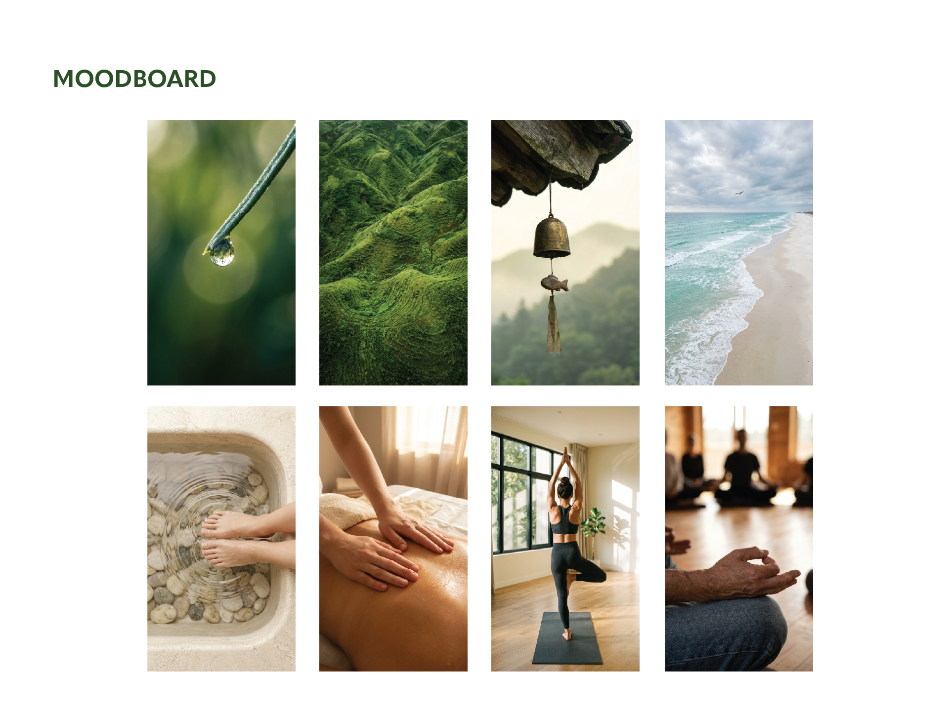
The symbol draws from four elements found in nature: leaf, wave, mountain, and bird — each representing a layer of 결. Combined into a single circular mark, they form a unified grain.
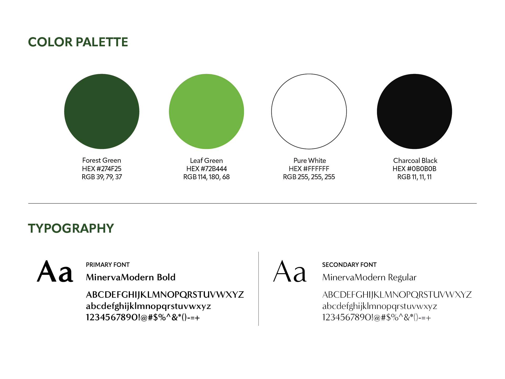
Primary color Forest Green (#274F25) grounds the brand in nature. Leaf Green (#72B444) adds life and movement. Typography in MinervaModern Bold brings quiet authority without decoration.
Brand Video
The brand film translates the identity into motion — moving through dew, water, stillness, and flight. Each scene connects back to the grain of 결.
An AI-assisted workflow was used throughout: from brand strategy to key visual generation and final edit.
To view the brand process video, visit: https://www.instagram.com/reel/DYkJ8fVJi9v/
© 2026 Ieum Creative
Connecting ideas, people & brands.
Let’s create something meaningful together.
✉️ hello@ieumcreative.com
Connecting ideas, people & brands.
Let’s create something meaningful together.
✉️ hello@ieumcreative.com